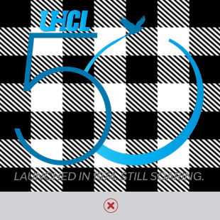
50th Anniversary Branding Toolkit
If you are with the media or a vendor and need access to UHCL 50th Anniversary assets, please email brandguide@uhcl.edu.
All UHCL 50th Anniversary Branding Elements
Browse through the UHCL 50th Branding Toolkit to access and download the following listed assets.
- Design Elements
- Digital Swag
- Email Signatures
- General Email Header
- Geometric Backgrounds
- Letterhead
- Logo Files
- PowerPoint
UHCL 50th Anniversary Logo
To maintain brand integrity and alignment, please adhere to the following guidelines when utilizing the 50th Anniversary Logo. For any questions, please contact brandguide@uhcl.edu.
Download UHCL 50th Anniversary Logo Guidelines (PDF)
Approved Logo Colors
Do not alter logo file colors or introduce new, un-approved colors.
- Color Palette: View the UHCL 50th Anniversary Logo Guidelines (PDF) for full-color specifications.
- Greyscale: For use when color printing/usage is not an option.
- All-white: For use when the logo must appear over a dark background.
Primary With Slogan Logo Download
For use in most instances where the 50th logo must stand on its own.

Primary No Slogan Logo Download
For use when the university logo and/or the slogan appear separately on the same piece.

Scale Up Logo Download
Thicker "5" and "0" with larger Hawk. For use on signage. Can also be used when logo will appear on small items (lapel pins, etc.)

Extreme Scale Up Logo Download
Thicker "5" and "0" with oversized Hawk. For use on billboards or situations where hawk is meant to be an extension above signage.

Logo Usage Guidelines
Correct Logo Usage
- In general, the 50th Anniversary logo works best on a white/light background.
- For use on a photo, it’s best to use the reversed version over a dark area.


Incorrect Logo Usage
- In general, the 50th Anniversary logo works best on a white/light background.
- For use on a photo, it's best to use the reversed version over a dark area.
- Do not use the logo over a solid color that is too intense or is too similar in value to the colors of the logo.
- Do not use the logo over busy photos or busy patterns.
