Visual Style
University of Houston-Clear Lake provides a pathway to success for students in the Houston Bay Area and beyond. For UHCL to stand out among the many choices available to prospective students, we must differentiate ourselves from other universities. And, as the University develops into a four-year institution, we need to consider how we present ourselves in an increasingly competitive higher education market.
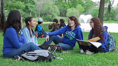
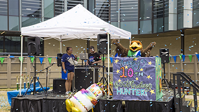
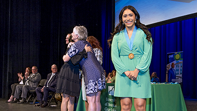
UHCL's Brand Guide was created to assist University departments in presenting a strong, focused brand identity through graphics, tone and message when communicating about UHCL. The Web Style Guide is an extension of the Brand Guide. Color, typographic style, photography, layout, voice and messaging on the website are all consistent with UHCL print collateral and environment installations - modified to meet accessibility standards and web design best practices.


