Typography
Typography consists of the arrangement and style of fonts and texts used to display a brand's values and identity. UHCL's branded fonts are COFO Sans VF and Freight Text Pro, as well as the universal font, IBM Plex Mono. We've also employed alternative Google web fonts for internal use if the aforementioned fonts are unavailable: DM Sans and Libre Baskerville. Each of these fonts is assigned for use in certain types of writing, such as headlines, pull quotes, and adjectives.
UHCL Branded Fonts
![]()

Google Alternative Fonts
DM Sans
DMS Sans is the Google alternative font for CoFo Sans VF, if the latter font is unavailable. It should be used only in places where CoFo Sans VF would be used. See Usage Tips section below for more information.
Libre Baskerville, Italic
Libre Baskerville Italic is the Google alternative font for FreightText Pro Semibold Italic, if the latter font is unavailable. It should be used only in places where FreightText Pro Semibold Italic would be used. See Usage Tips section below for more information.
Universal Font
IBM Plex Mono, Semibold
Usage Tips for UHCL Branded and Google Alternative Fonts
| Font | Usage |
|---|---|
| CoFo Sans VF Bold and DM Sans Bold | Headlines |
| CoFo Sans VF Medium and DM Sans Medium | Subheadlines and pull quotes |
| CoFo Sans VF Regular and DM Sans Regular | Long-form body copy |
| FreightText Pro Semibold Italic and Libre Baskerville Italic | To highlight benefits of key takeaways by drawing attention to adjectives, adverbs, and keywords |
| IBM Plex Mono Semibold Italic | Labels, headings, page numbers, wayfinding, and special use cases, such as Inspire Higher |
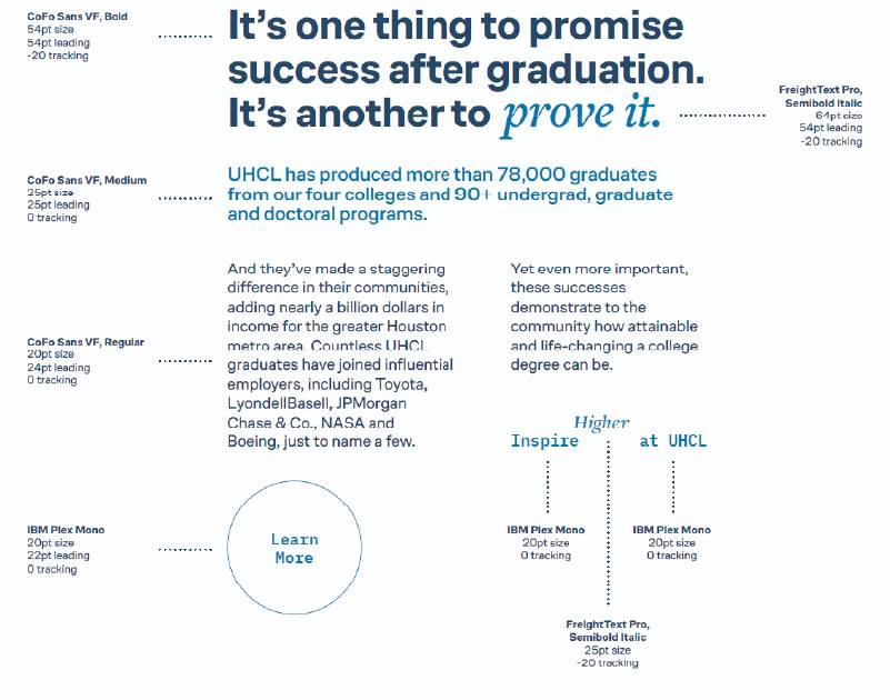
Type Hierarchy: Adobe Fonts
Type hierarchy is crucial in design as it organizes information and guides the reader's
attention.
For UHCL's brand, maintaining type hierarchy ensures key messages stand out and reflect
the
institutional identity. Use distinct font sizes and weights for headings, subheadings
and body copy
that align with this example to maintain a consistent brand experience.

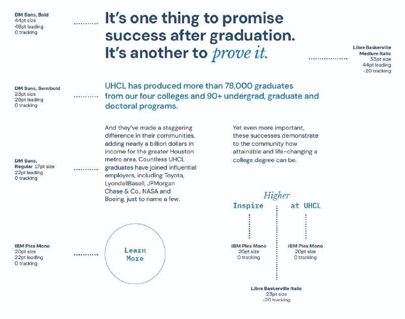
Type Hierarchy: Google Fonts
Type hierarchy is crucial in design as it organizes information and guides the reader’s attention. For UHCL’s brand, maintaining type hierarchy ensures key messages stand out and reflect the institutional identity. Use distinct font sizes and weights for headings, subheadings and body copy that align with this example to maintain a consistent brand experience.


