Graphic Elements
The graphic elements of a brand's visual identity should communicate a specific message with the audience, enhance aesthetics, create an identity, and guide the viewer's eye. They should also evote certain emotions for the viewer while ensuring balance. UHCL's graphic elements consist of the following:
Abstract Gradients
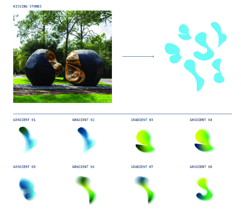
These abstract elements are inspired by Artist Pablo Serrano’s 1977 "Spiritus Mundi," also known as the Kissing Stones. These elements evoke feelings of natural life through movement and color and can be used to add visual interest to solid-color backdrops or photography.
Abstract Gradients Color Pairing
This is a color pairing guide for using the abstract gradients. Gradients are to be used only on the colors shown. These pairings are also available as templates in Adobe Illustrator.

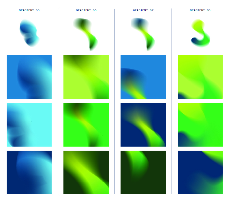
Abstract Gradients Usage
These elements are to be used sparingly. The abstract gradients work best on full floods of color and, occasionally, in the corner of images.
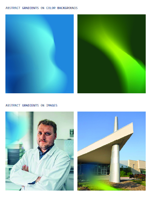
How to Use: Abstract gradient backgrounds are created by directly pasting a gradient into a shape. Crop or scale the gradients to avoid harsh edges. The gradient backgrounds should feel soft and natural. Please reference the abstract gradients color pairing section when creating these types of graphics.
How to Use: Abstract gradients can be placed directly on top of images. Do not place gradients on top of faces. Do not use gradients that blend in with the image. The goal is to create visual contrast. In most instances, the abstract gradients work best when placed in the corners of images. This photo treatment is to be used sparingly and should never distract from the main subject in the photo.
Hawk Illustrations
The hawk illustrations, inspired by UHCL's mascot, feature bold lines and vibrant colors that capture the essence of the school's spirit. Use them sparingly to add a touch of school pride to your designs.
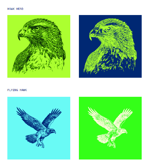
How to Use: These illustrations should only be used on solid-color backgrounds. They should not be placed on top of images, gradients or text. These illustrations should be used sparingly in layouts and brand materials. Use only one hawk illustration per design. The hawk illustration should only be set in colors from the UHCL color palette.
Flexible Linework
This graphic element features flexible lines inspired by the architecture on UHCL's campus.

How to Use: The flexible linework graphic element is used by placing it on top of images and backgrounds. The linework graphic should always be between 1 pt. and 1.5 pt. stroke weight. The stroke weight can be increased or decreased depending on the element’s visibility within the composition. The linework should never cover human faces or interfere with the main subject of an image. The linework should be placed at the top or bottom of the page. The linework can be any color within the UHCL color palette. For questions about color usage, please reference the color palette and color usage pages earlier in these guidelines.


