University Logo Usage
UHCL Logo and Signature Line
It is critical in maintaining a consistent graphic identity for UHCL that the integrity of the logo and signature line be preserved. Do not separate, distort or reconfigure any element of the logo or signature line.
The stacked logo is defined as the complete unit made up of the logomark (the square element) and the logotype (the university’s name) and is not to be altered.

The signature line logo is also a complete unit composed of the logomark and logotype, and is not to be altered.

UHCL Logo Specifications
The UHCL stacked logo should not be used with a width smaller than .5 inches. The height of the signature line logo should not be less than .25 inches. These specifications are dependent on the medium on which the logo will be printed. For large-scale projects, such as banners, or small scale items such as pens, contact Marketing and Communications to obtain image files sized to ensure legibility.
UHCL Logo Placement
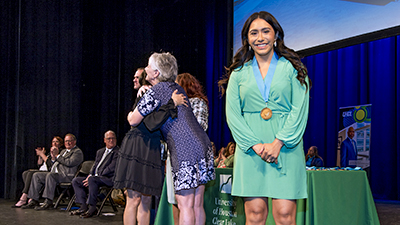
There should always remain a minimum distance around the entire logo. The size of the logomark (square element) should be measured to create the distance needed on all sides around the logo in its entirety. For example, if the logomark is 1 inch by 1 inch, then the space given on all sides of the logo should be 1 inch. The UHCL logo should always be placed on a readable background to ensure legibility. For example, do not place the logo directly on top of a color photo or a background color that makes the logo unreadable.
History of UHCL Logo
The UHCL logo was created in 1994 to portray the institution's identity in graphic form. The design criteria, established through a series of focus groups, described a logo that reflected the university's culture, which is professional yet personal, as well as progressive in nature, yet grounded in the traditions of education; incorporated the university's physical environmental surroundings; and emphasized a service area beyond the immediate boundaries of Clear Lake and the upper Gulf Coast of Texas.
Key elements of UHCL’s final logo design include three components: a square-shaped mark that captures in abstract form Texas's upper Gulf Coast and the dual aspects of the university’s culture; green and blue colors that symbolize natural environmental elements; and the university name in typeset in Garamond Book Condensed, a contemporary version of a traditional font.
To Request Logo Files
University College/Departments: Please visit the Downloads section and log in with your UHCL credentials, or email us at brandguide@uhcl.edu for assistance.
External Partners: Please email us at brandguide@uhcl.edu for assistance or logo usage questions.
Our logo is a symbol and visual representation of who we are as a university. It's important to keep the following in mind when using our logos.
Logo Elements
In the primary logos, the block graphic and the word mark should always be used together.


Added Graphics
No other graphics should be attached to the logo.

Proportion
While logos may be resized, the logos should not be stretched or flattened and should keep their original proportions.


Size
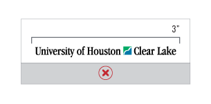
The stacked logos should not be smaller than one inch tall and the signature line logos should not be smaller than three inches wide.
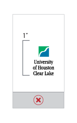
Space
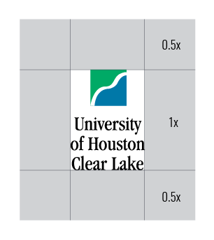
Logos should have space equal to half the height of the logo around all four sides; it should not be placed on top of, behind, or against another image or too close to the edges of an item.
Color
Logo colors should not be altered or adjusted.

Contrast
White versions of the logo should be placed on dark backgrounds and our full-color and black logos should be placed on light backgrounds.
